nbsp;           nbsp;           nbsp;           nbsp;           nbsp;           nbsp;                       nbsp;           nbsp;           nbsp;           nbsp;           nbsp;           nbsp;                       nbsp;           nbsp;           nbsp;           nbsp;           nbsp;           nbsp;          

ansprechender Websitendesign


Meine ausgearbeitete Definition des "Ansprechenden" in den fünf Kriterien:


Vermittlungsinhalt


Farbe

margin="10px"


Kontrast

margin="10px"


Schrift

margin=10px


Bildmaterial


Quelle der Bilder:


Vermittlungsinhalt:
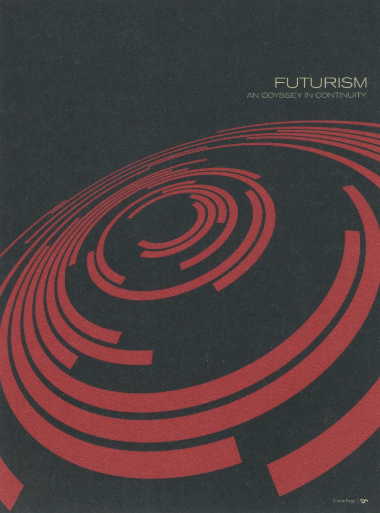
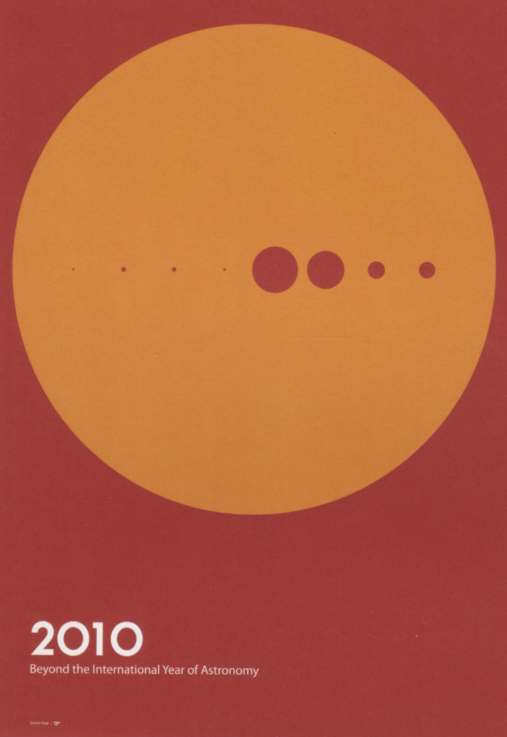
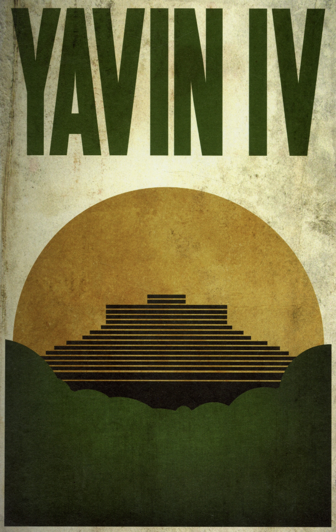
Titelbild: Bild aus "The Modernist"
Grafik: niclaslutz (Text + nachträglich vektorisiert)
- Bild: https://dilectacycles.com/wp-content/uploads/2021/02/03b-scaled.jpg

Farbe:
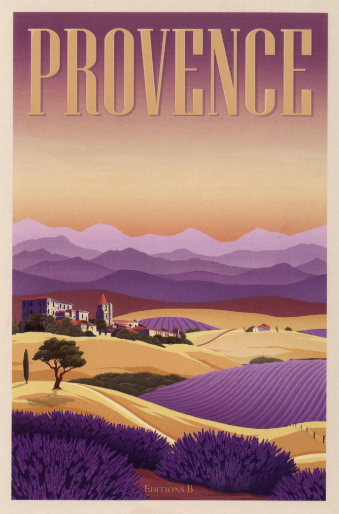
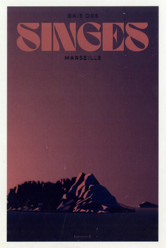
Titelbild: Postkarten von "Editions B"
Grafiken: niclaslutz (Layout, Farbe, Text + nachträglich vektorisiert)
- Bild1: https://paireyewear.com/cdn/shop/articles/nav-asset-mens.png?v=1714579383
- Bild2: https://www.extreme-icecream.com/wp-content/uploads/2025/02/Rasp-Brownie_X_2025_V2-X-P-scaled-905x1280-c-default.jpg

Kontrast:
Titelbild: Bilder aus "The Modernist"
Grafik: niclaslutz (Layout, Farbe, Text)

Schrift:
Titebild: Bilder aus "The Modernist"
Grafik: niclaslutz (Layout, Farbe, Text + nachträglich vektorisiert)
- Bild: https://img.freepik.com/fotos-premium/rote-champagnerflasche-auf-hellrotem-hintergrund_711700-9339.jpg

Bildmaterial:
Titebild: https://www.fototapete.ch/bildkatalog/show/57429-Buntes-Chamaeleon-Nahaufnahme-vom-Kopf
Grafik: https://turbologo.com/de/blog/mercedes-benz-logo/ (nachträglich vektorisiert)

"The modernist", edited by Robert Klanten und Hendrik Hellige, Berlin: Gestalten, 2011
https://www.perlentaucher.de/buch/hendrik-hellige-robert-klanten/the-modernist.html